Quarantiner
A service for helping travellers plan their quarantine and adjust to the current restrictions by informing them of the current quarantine protocols in place.
The application can help people to self-diagnose or book a test if it is necessary. It also provides them with the motivation to quarantine by talking to a chatbot and sharing their progress on social media, allowing them to feel part of a wider community in quarantine.

Time length
5 week sprint
Project type
Individual
Year
2020-2021
Context
I collaborated with my colleagues to create the concept. Under the theme of Living in Lockdown, we brainstormed and proceeded with the project for 6 weeks. My colleagues and I selected one persona each and individually designed the application to meet the specific needs of that persona.
Conducted Research
Issues
We found that there were people who had to travel despite lockdown restrictions due to unavoidable circumstances. We interviewed them about how they quarantined in this challenging situation.
Findings
We found that many international travellers were confused about the differing quarantine procedures in each country. We created three personas that reflected the concerns people travelling had about quarantine.
Problems
Despite such circumstances, there are people who have to travel abroad. And some people travel abroad discreetly without anyone knowing, but they don't know the right protocols and they don't quarantine properly, which harms others.
Opportunity
Encourage travellers and provide protocols for proper self-isolation to help them complete quarantine safely and confidently.
“How might we encourage awareness of safe travel for travellers?”

Style guide
Principles
Create a clean design to build people's trust. Since it is a health-related service, it provides information that can give certain information and trust. And it should make users feel like they're being cared for by the app.
Features
Core feature
Encourage people to quarantine with awareness of local guidelines.
Secondary features
Help to book a covid test.
Self-diagnosis system.
Users can check symptoms with a chatbot.
Countdown to the end of the quarantine.
SNS sharing service.
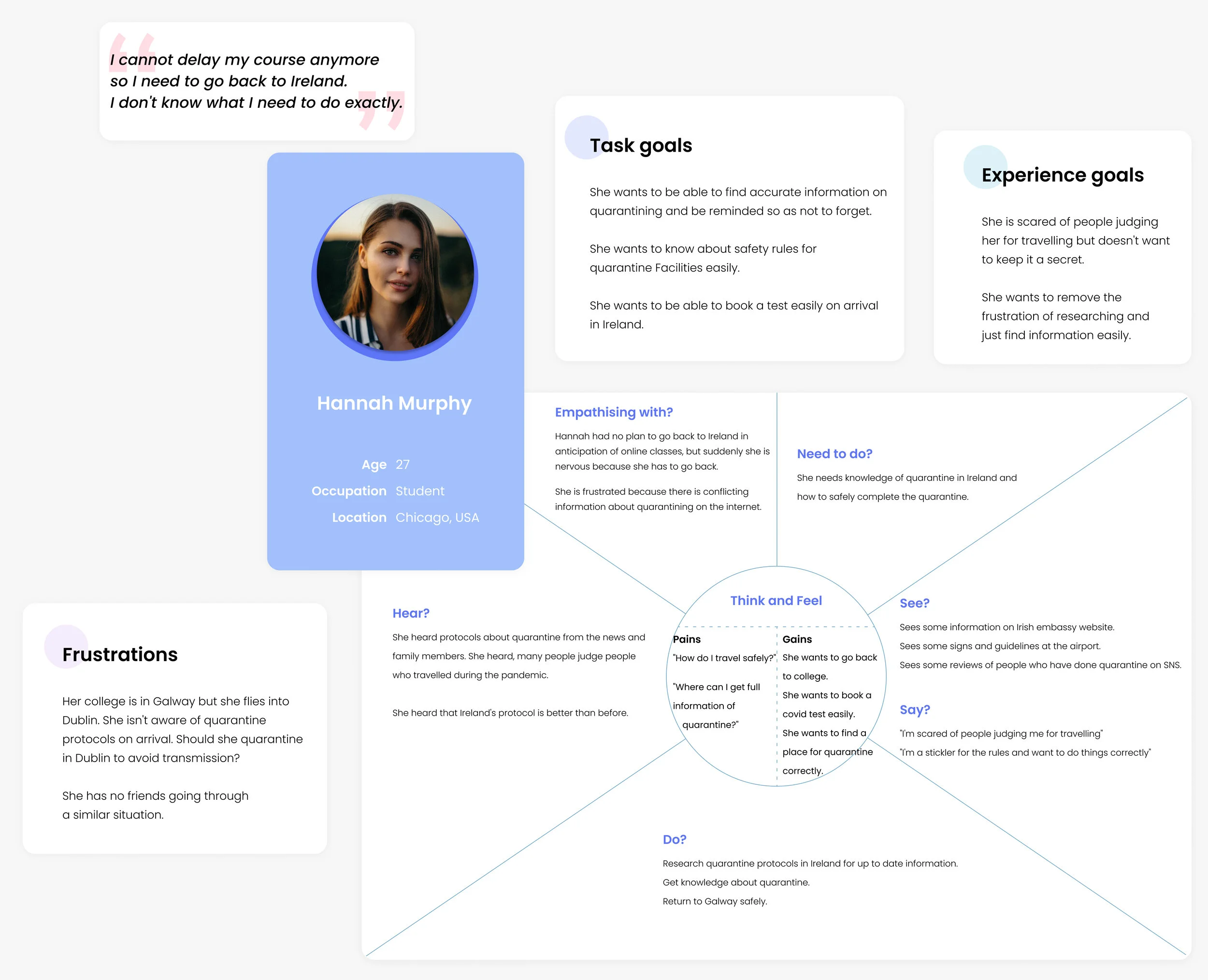
Persona & Empathy map
Based on the situations that real users can experience, it was easy to understand what they wanted to gain to meet their expectations.
This helped me identify the exact problem and set specific goals.
Storyboard
Based on the persona created above, a storyboard was created to show when and in what situations the user needs this platform, and when the user using this platform, her emotion change and achieving the goals was reenacted in a drawing.
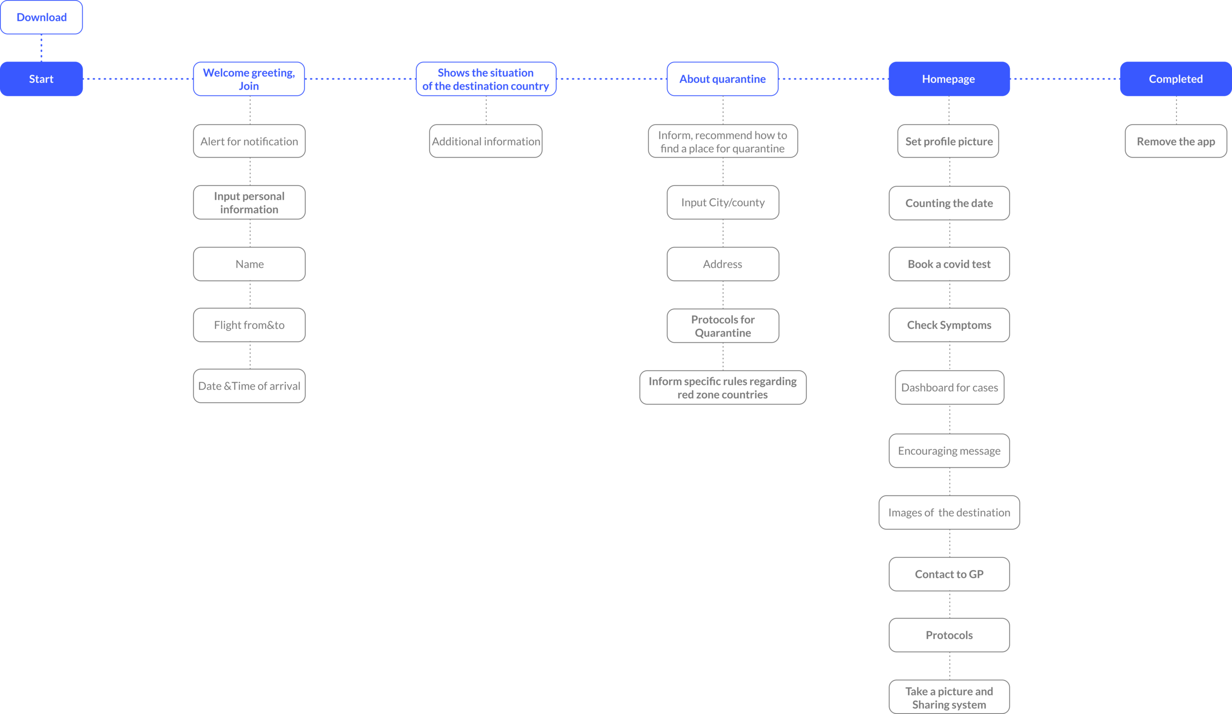
User flow(ver.01)
This is the fastest way to visualise the process.
This shows the pages or specific features required for prototyping, showing the process from launching the app to solving the problem and achieving the user's goal.
Prototyping
Paper prototype
By quickly mocking up the prototypes I was able to quickly explore how the user requirements might fit into the interface. I was able to trial these with people to see if their mental models matched and then I was quickly able to rapidly reiterate it upwards.
Mid-Fi prototype
Mid-fi allowed me to test with remote users.
It allowed me to test the bones of the core features.
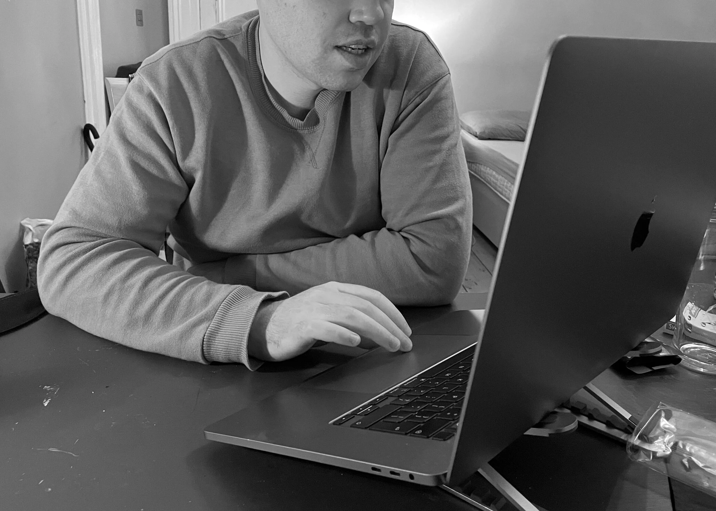
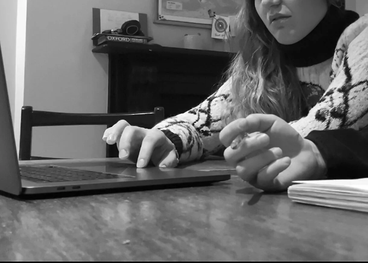
Usability testing
A test of the mid-fi prototype was conducted.
This greatly helped to identify usability issues and improve design through feedback from users.
“Too much text, a little bit boring.”
“This is exactly what I wanted!”
“Weird layout.”
Heuristic evaluation
A heuristic evaluation according to Nielsen’s Heuristics of Usability was conducted. This facilitated design development by making it easier to read specific feedback by process step.
User Journey map
User journey maps were created after usability testing, which played a major role in improving app design by identifying users' emotions throughout their experience of using the application.
Pain points
The chatbot was too robotic.
Unclear information about public transport.
It's hard to know what's important.
There is not too much information about quarantine.
Final user flow
As it is a platform that is only needed in special circumstances in a short period of time, I tried to simplify the user flow as much as possible.
Wire flow / UI flow

Hi-fi prototype
Among the problems discovered in the interview, I added the feature of counting the dates, considering that they do not know exactly when the quarantine ends. I also added a feature to self-diagnose covid-19 that users may be concerned about, and the user can ask questions or concerns during the quarantine period through chatbot at any time.
Home page
Information of lockdown
I designed with icons to make it easier for anyone to understand, and texts were simplified. It can also be downloaded, so information can be checked at any time even when the user cannot use the internet.
Guide of quarantine
This provides information on quarantine. I found the majority of those interviewed did not know the proper quarantine policy, so I added this screen, which is also easy to download and available offline.
Camera page
Based on Persona and Empathy map outcomes,
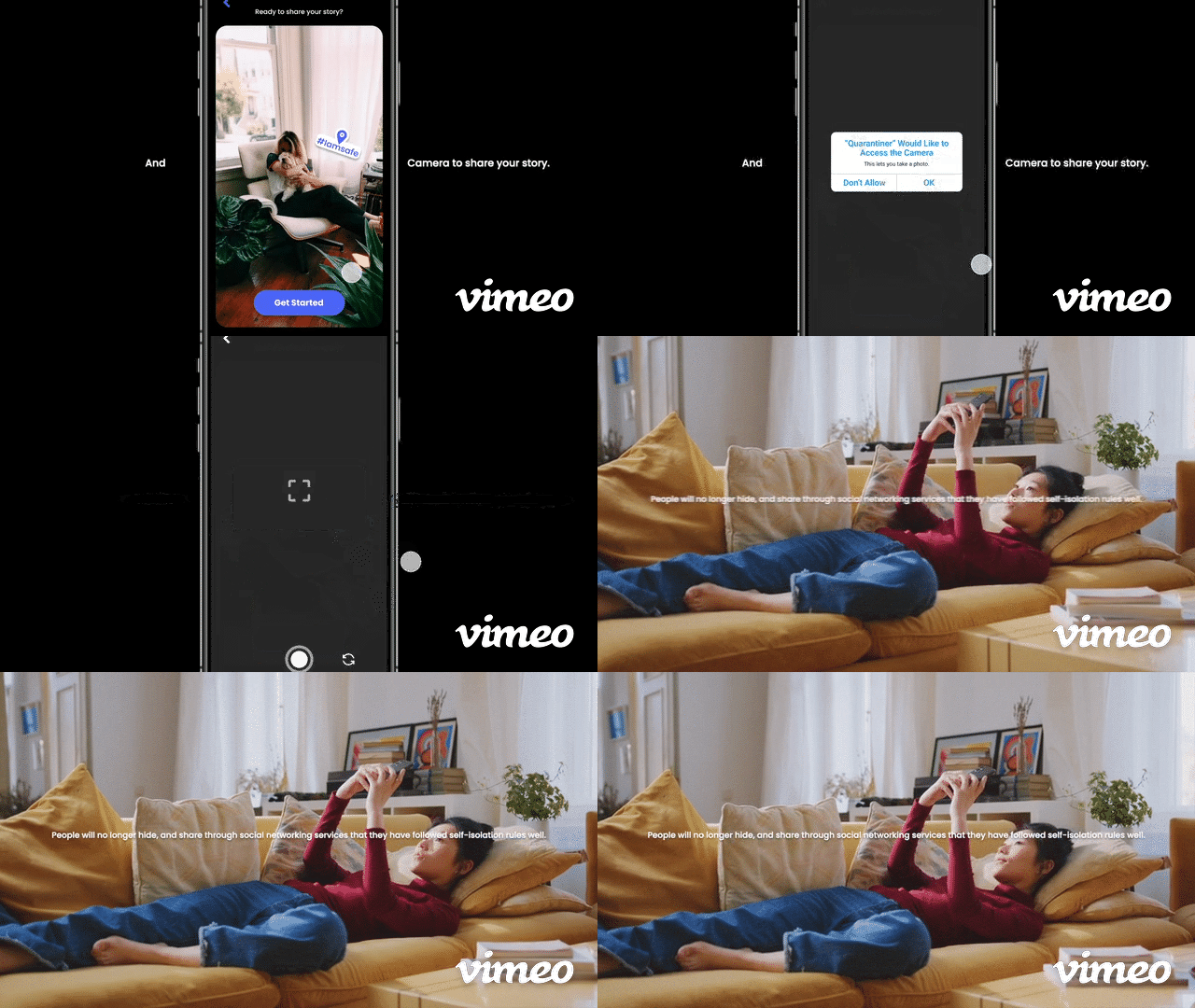
During the quarantine, the photo taken through the application added features that can be shared with the social networking service. This shows people that they were doing well in self-isolation and followed the rule.

You don’t need to open the app every time.
It will send a daily notification, then you can choose to open or skip.

