Peblo
Fintech Startup
Peblo is a platform that facilitates seamless transactions for creators, allowing them to receive payment immediately upon completion of brand deals and easily manage transactions within the app.
Peblo
Dublin, Ireland
Product designer
2021 - 2022
I contributed to this company by designing digital products such as applications and web apps, as well as assisting with document design including invoices and contracts. Additionally, I supported other team members with deck design, ensuring alignment with the company's service direction. In the initial stages, I took the lead in exploring design directions to ensure that our digital products aligned with the company's service goals and user requirements. Through iterative design processes, I enhanced user interfaces to be intuitive, visually appealing, and consistent with the established brand identity. This strategic approach significantly contributed to advancing the company's service objectives.

Personas
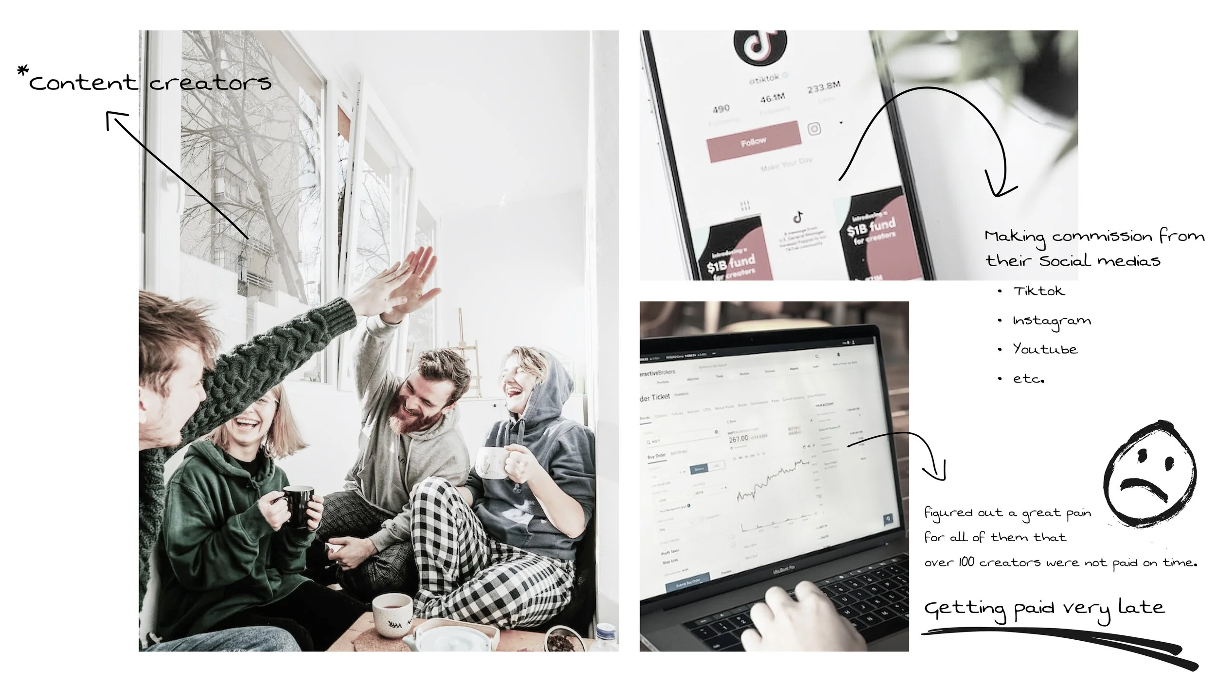
By crafting personas, we gained valuable insights into the expectations and challenges of the primary users of this platform, content creators. This process was instrumental in defining the key functionalities of the platform.


Initial stage
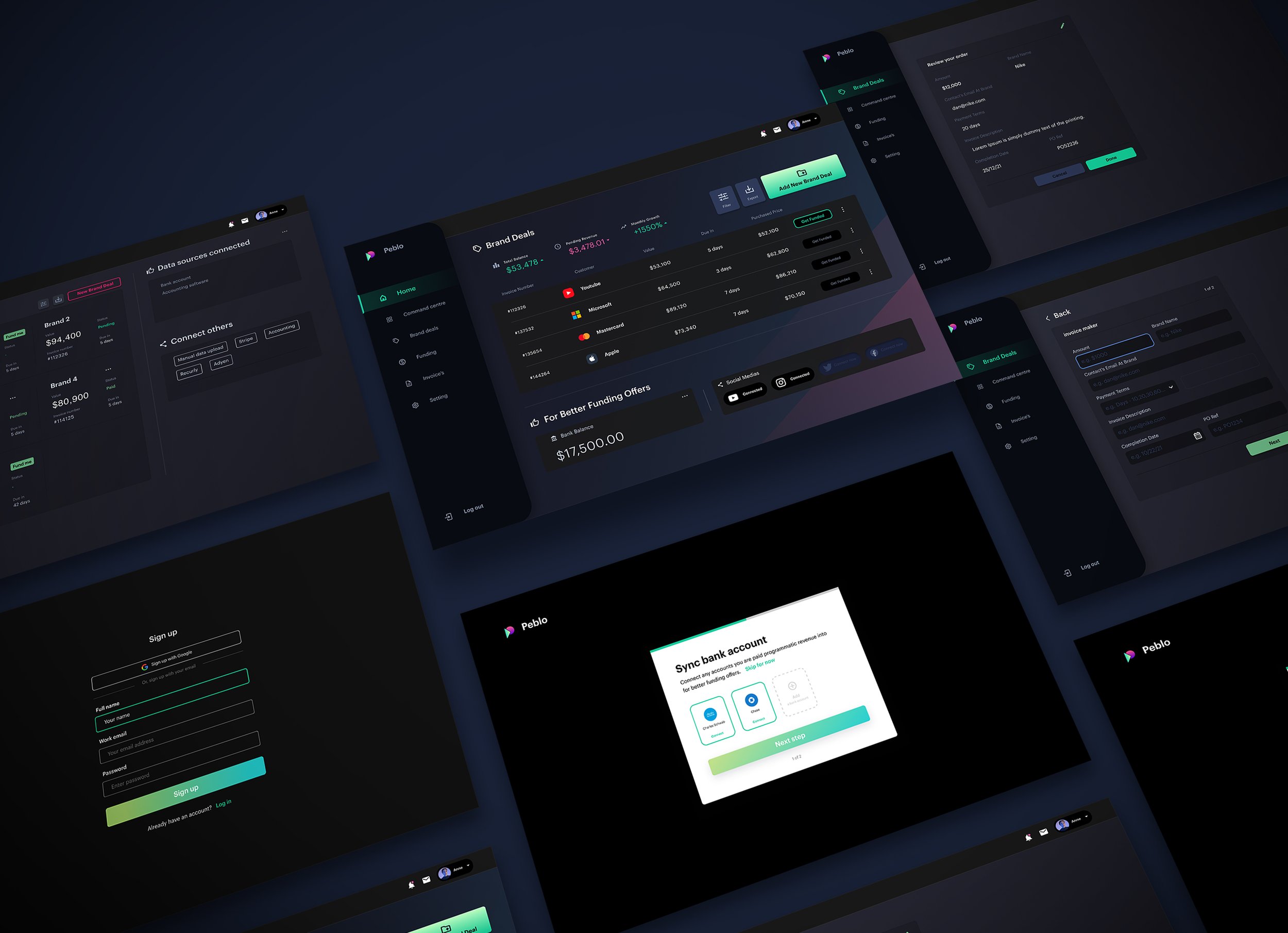
As the sole designer without a design team, collaborated with the company's founder to create the logo, brand colours, fonts, and design system.

At the initial stage, I established brand colours, fonts, and a basic style guide, ensuring consistent visual language across all team members. This allowed for seamless collaboration and clarity in design decisions.
Additionally, while designing both the application and web app screens within a short timeframe, I gained valuable insights into the importance of prioritising user experience over feature quantity. This insight led to the realisation that excessive features could negatively impact usability. Thus, the key takeaway was the importance of aligning design choices with the precise expectations of our primary users for a more user-centric approach.

High fidelity prototyping
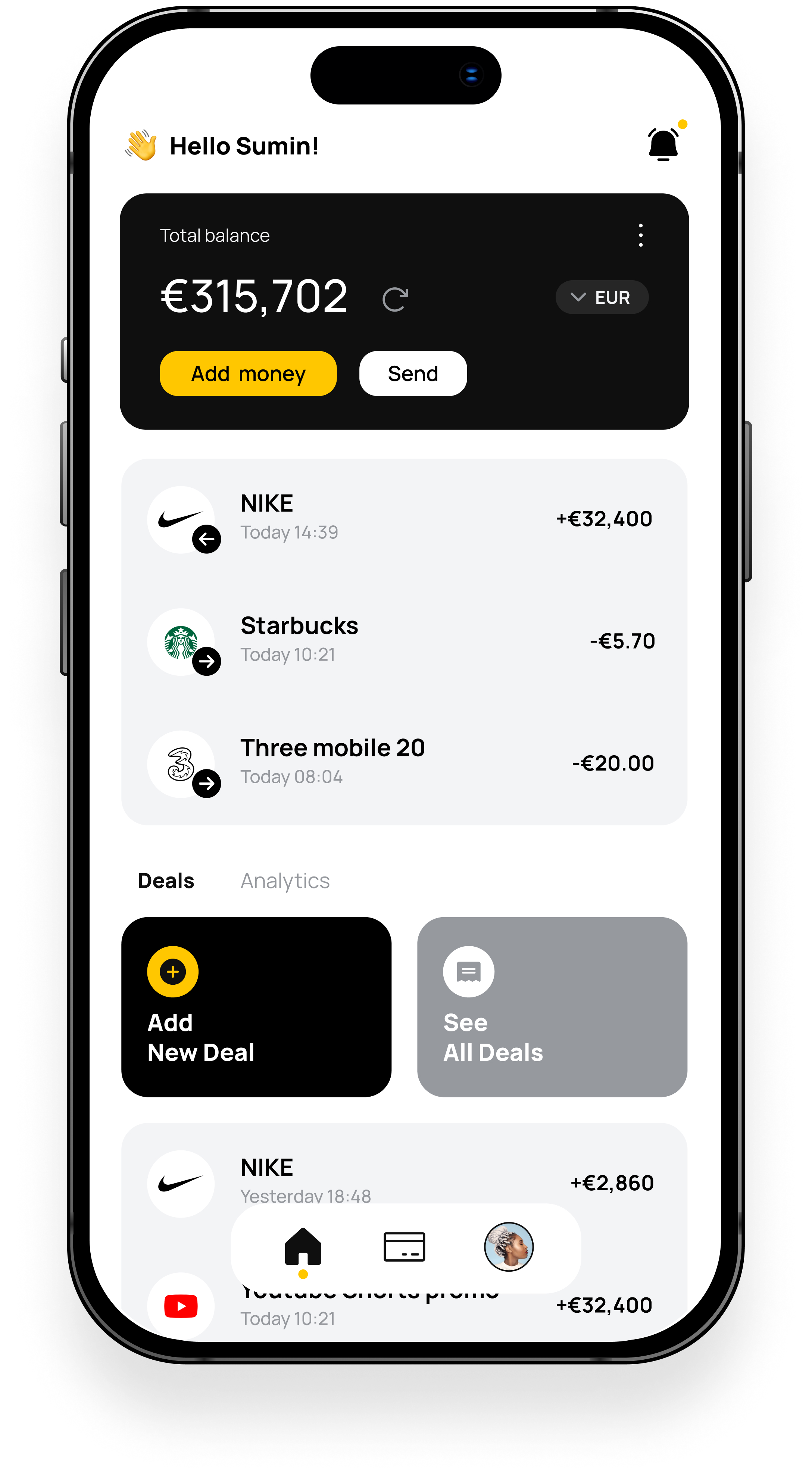
After a shift in design direction, I recognised the importance of refining the user experience by removing superfluous features. With simplicity as the primary focus, I meticulously curated each element of the interface to ensure clarity and functionality. Beginning with initial sketches to visualise the concept, I iteratively refined the design, emphasising essential components necessary for efficient navigation and task completion. This approach aimed to maintain a clean and intuitive user interface, aligning closely with the fundamental principles of banking app design while enhancing overall usability and satisfaction.


